BPS Periodontics came to me with a large problem, an indistinct logo, an out-of-date website, and an aging customer base with no real idea on how to target a younger clientele for growth.
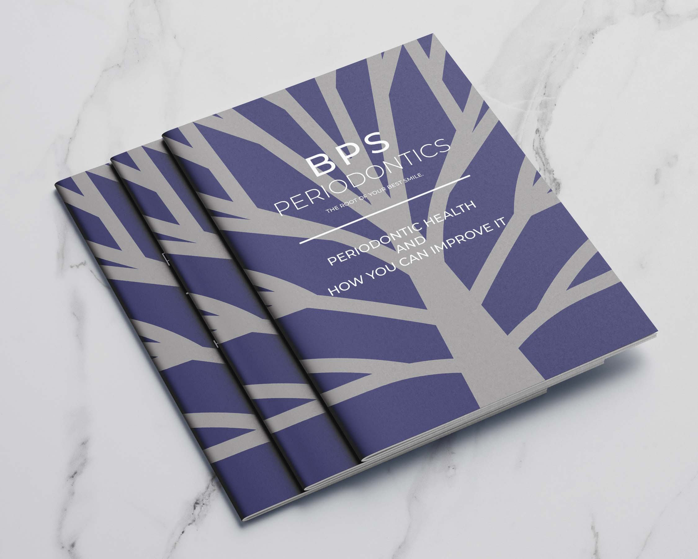
Starting with their logo I decided that BPS Perio needed to reposition their brand from an older legacy practice to a fresh and clean practice that could keep their current base while also being attractive for a new, younger clientele. After completing their rebrand, I worked on a refresh of their website by trying to push them to incorporate the latest in technology for online patient onboarding as well as digital form capture, all while maintaining HIPPA compliance.
BPS Perio came to the table with a design in mind for their new logo but after a feeling-out process we decided to scrap that idea and move on. What followed was an extensive discovery meeting and research process in which I arrived at their new logo concept.
BPS's new website needed to hit a very small target, a site that was easy enough to navigate for the existing clientele but sleek enough to attract a new younger customer. I achieved this by keeping the site content easy to follow and navigate while also utilizing a fresh and modern aesthetic to appeal to the younger crowd.
Visual Identity Design
Web Design
Print Design